
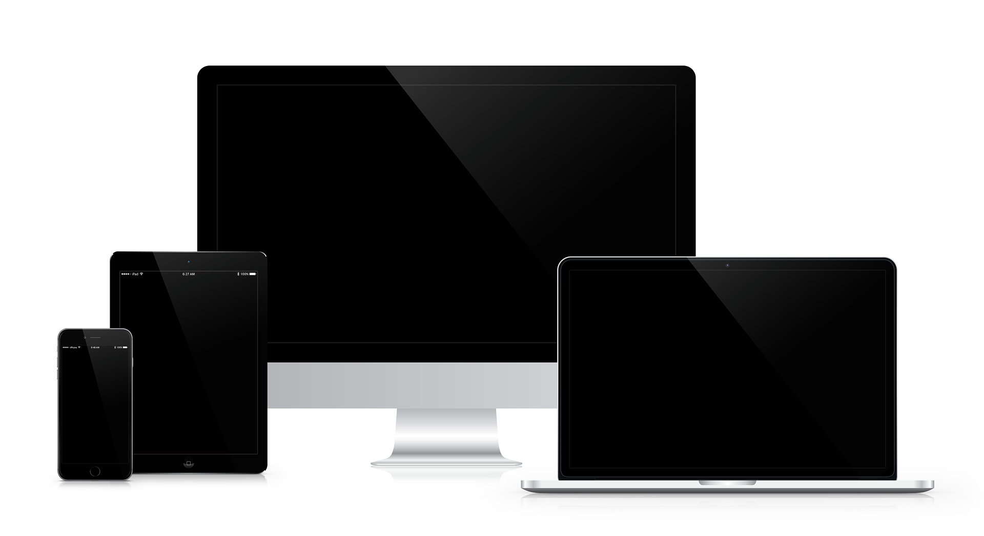
What Is Responsive Web Design?
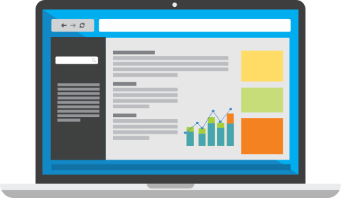
What Is Responsive Web Design?
How is it possible for websites to keep up with the plethora of screens across the world? The solution for this happens to be responsive web design. Responsive web design allows your website to adapt as well as deliver the best experience to the users irrespective of whether they are using their laptop, desktop, smartphone, or tablet. However, for this to happen, a responsive design will be required by your site out there.
Benefits of responsive web design?
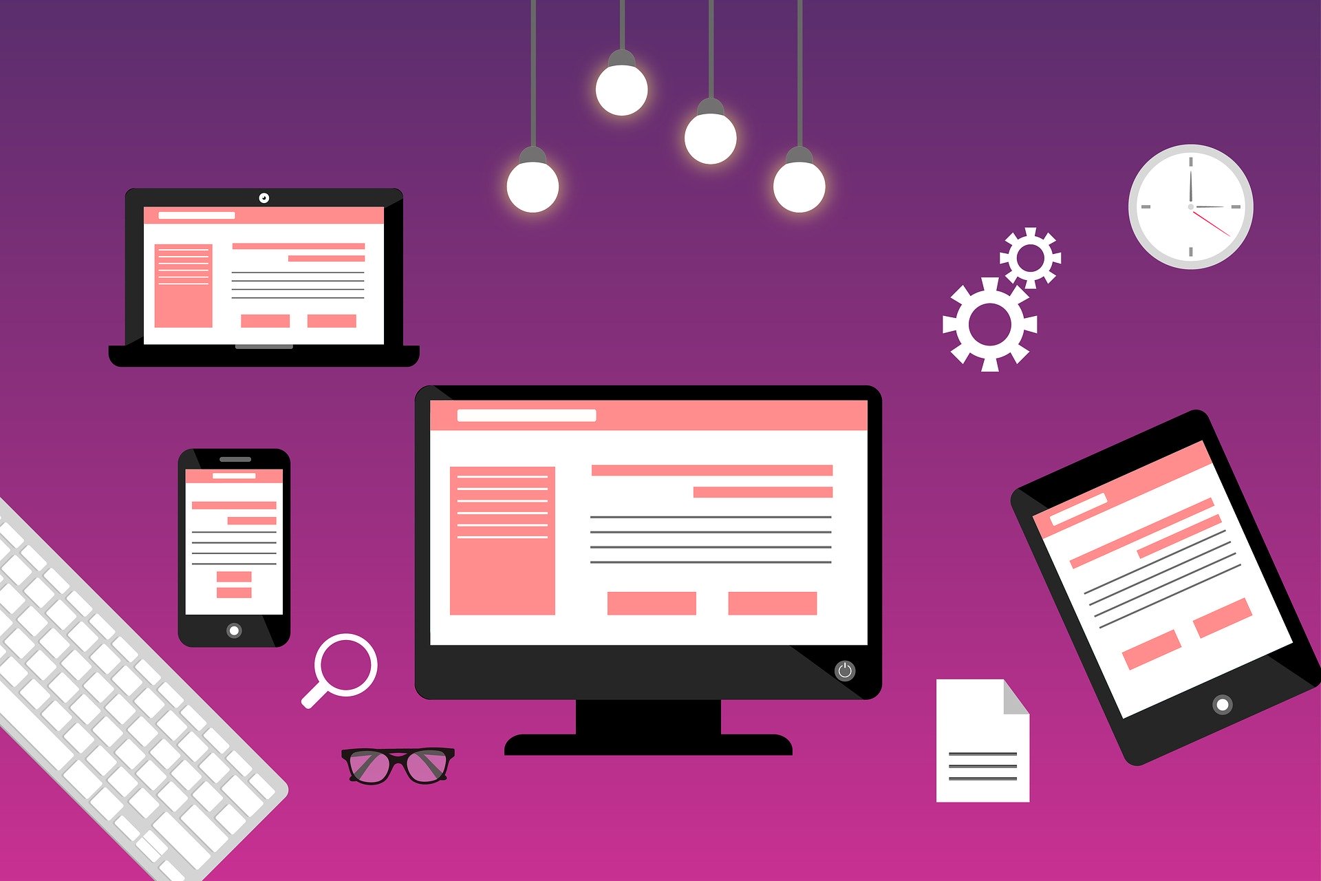
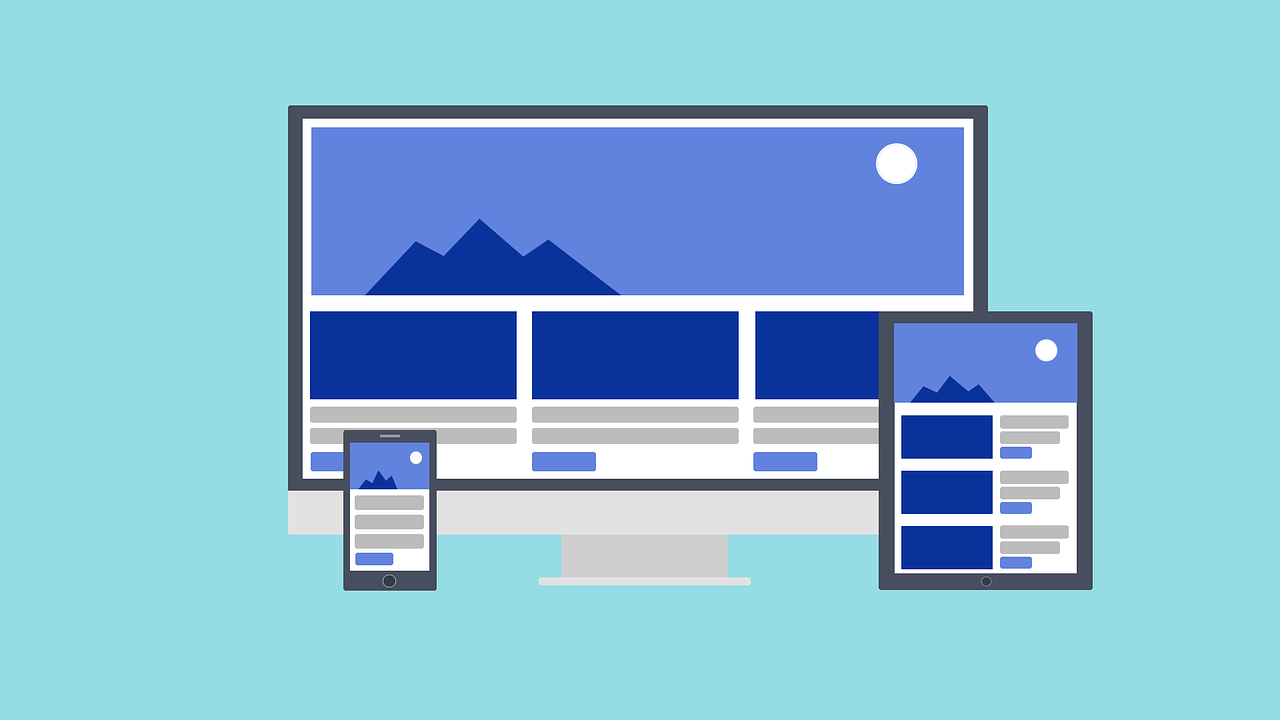
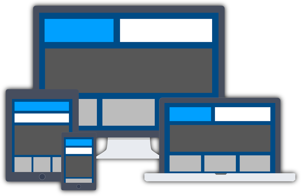
Responsive web design is accountable for describing a web design process that enables sites and pages to render on all types of gadgets and screen sizes by adapting to the screen automatically regardless of whether it is a desktop, smartphone, tablet, or laptop.
At present, responsive web design has turned out to be an innovative web standard. This challenge has been accepted by many companies who have established particular design solutions or have tried to address the problem cross-platform. In the subsequent paragraphs, we will take a look at some responsive web design tips that will help your design procedure and also make it all the more effective.
1. Planning
Planning is undoubtedly the first priority. Once your design challenges are solved on paper, you are prepared to build your website.
2. Use prototyping application
One specific application known as Adobe Edge Reflow will enable you to use media queries, establish breakpoints inside the program, and also design the layouts so that it fits your desktop, smartphone, or tablet. Following this, the CSS can be copied into another application like Adobe Dreamweaver for refining the design further.
3. Take into consideration mobile-first technology
This will be precisely where you will create the mobile site and then build the desktop and tablet designs by scaling up. The logo or the text happens to be amongst the most significant concerns for all 3 types of gadgets. If you can read the text easily on your mobile device, you should not face any problem with your tablet or desktop as well.
You can contact our web design Chorley team for more info!
4. Beware of navigation
If there are 2 to 3 navigational menus on your site, they can be included on the screen in a simple menu. If there are some more menu elements, it might be sensible to create a single icon which opens up into a drop-down menu of more menu items. There is one more option which will be to use an icon menu style as one can see with a GoMobi website.
5. First, establish the appearance and feel of the site
You will come across several businesses that build the whole layout of the interface initially prior to doing any sort of coding. This helps to make sure that they have the same look and feel as desired by the client before any coding is done by them. While creating a layout for any mobile site, make sure that the buttons are big enough for your fingertips. One more thing will be to maintain the simplicity of the design while keeping it functional too. A lot of designers have the propensity of adding a lot of things to a mobile interface that might lead to usability and design issues. Try to keep it simple whenever you are in doubt.
Our Bolton website design team would love to answer any of your questions on web design!
6. Make use of several software applications
Although using a template along with WordPress is going to be enough for many users, if you like to create a complicated design it might be imperative for you to make use of custom applications and you might need to code every single site separately.
7. Graphic design
Make it a point to create optimized graphics for every layout while constructing responsive design layouts. This helps to minimize bandwidth and scaling issues. Use JPEG, PNG-8, and GIF file formats. Refrain from using PNG since it might bloat the file sizes by up to 10 times.
You should check out this awesome graphic design Bolton agency – Portfolio!
8. With images use exact measurements
Try to use exact measurements with images (500 x 350 px at 100 PPI) and set matching image dimensions. This will help to eliminate scaling and you will also be able to maintain the quality and the resolution of the images. If the images happen to scale, this might lead to resolution and colour depth issues.
9. Clear design
This is very essential when it comes to responsive web design. Ensure to get rid of all the non-essentials while designing the site. It will help in improving the loading time of your page.
Conclusion:
Performance matters a lot when it comes to responsive web design. Hopefully, these above-mentioned tips will help to get the job done for you.
visit my blog
3 January 2020With havin so much written content do you ever run into any
problems of plagorism or copyright infringement?
My blog has a lot of completely unique content I’ve either
written myself or outsourced but it looks like a lot of it is popping it up all
over the web without my agreement. Do you know any techniques to help
prevent content from being stolen? I’d certainly appreciate it.
MLA Web Designs
5 January 2020As we wrap up another year of web design it’s important to slow down and take a look at what trends will stick around. keep it up
Rahate
8 January 2020Very interesting and valuable information. It is in deed a work of Web Developers AND Web Designers to work on this. A great layout from the designers with responsive design and usability in mind
click here
22 January 2020Useful information. Lucky me I found your website accidentally, and I’m stunned why this coincidence didn’t took place in advance!
I bookmarked it.
admin
6 February 2020Thanks for the comment
Laravel Development Services
27 January 2020Nice post! The information you provided is very helpful if someone is planning to Digitalized our Business. I think Digitalopment is a better way to get all the information about Digital Marketing and Laravel Development Services.
admin
6 February 2020Thank you!
boletin certificado de instalacion electrica en industria
5 February 2020Somos una empresa dedicada tanto a la reparación de equipos electrónicos del hogar como a instalaciones y reparaciones de antenas, porteros automáticos, videoporteros, averías de electricidad, domótica, etcétera. Además de esto debe tener claro que nuestra asistencia se realiza de forma inmediata y que esto, a comparación de otros, no hace que los gastos sean mayores. Otro aspecto que debe tener en cuenta es que al contactar con nosotros un técnico profesional será el que atenderá su caso y el cual de forma inmediata podrá ayudarle. Así mismo, y en el caso de que el reparar su electrodoméstico tome más tiempo y deba llevarse al centro técnico, debe saber que contamos con electrodomésticos de cortesía. Finalmente debe saber que nuestro equipo es completamente profesional y que por ello solo trabajamos con repuestos completamente originales. Puedes confiar en los frigorífiocs BOSCH para la conservación de tus alimentos.